Toss The Templates, Embrace a Design System
Everybody loves a template. Are they efficient? Yes. Are they the most boring thing on earth? Also yes. So how did we provide the Los Angeles Chamber of Commerce the efficiency they love from templates, but the flexibility to keep things visually interesting over time?
Two Words: DESIGN SYSTEM.
What, exactly, is a design system?
The short answer: a design system is a collection of rules, guidelines, and supporting visual assets. Compared to a template, which is a fixed layout with pre-defined styles, a design system provides incredible visual flexibility while still maintaining brand consistency. Want to see how it works?


Story Time…
The Los Angeles Chamber of Commerce was concerned that there was no consistency among the myriad of communication pieces they produced and commissioned us to help streamline their efforts. So we built them a comprehensive design system.
Here’s how we did it…
1. Established A Goal
First things first – what do the LA Chamber’s materials need to do? In a nutshell, they needed to embody the LA Chamber’s mantra of being “Bold In Business”
We established that ‘bold’ doesn’t mean loud. It means making focused, smart, and deliberate decisions. We determined that we could best visualize ‘bold in business’ by embracing visual weight and breaking visual boundaries.

2. Determined Layout Rules & Terminologies
We then audited all of their departmental communications materials to learn what types of information they typically share with their various audiences.
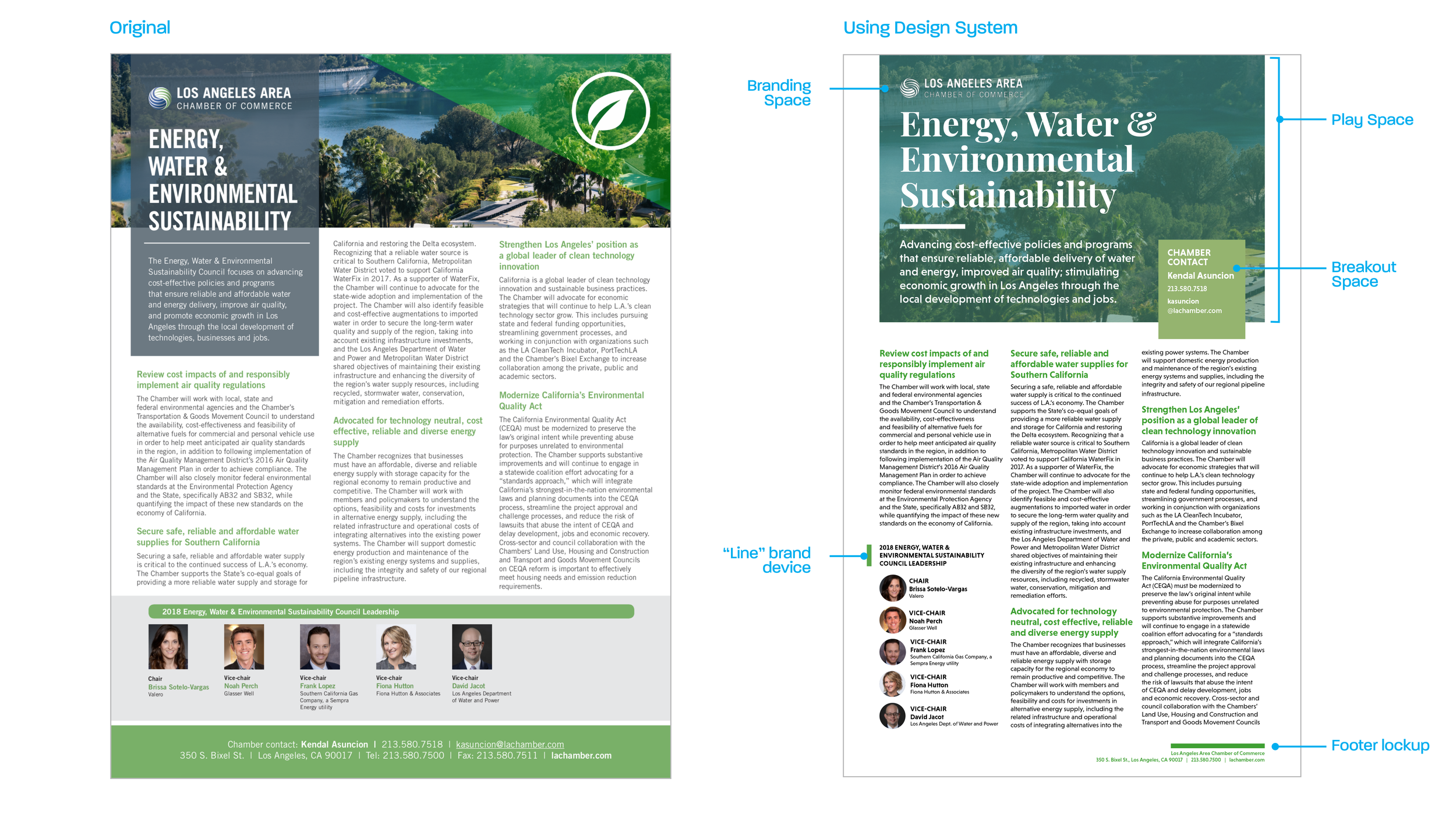
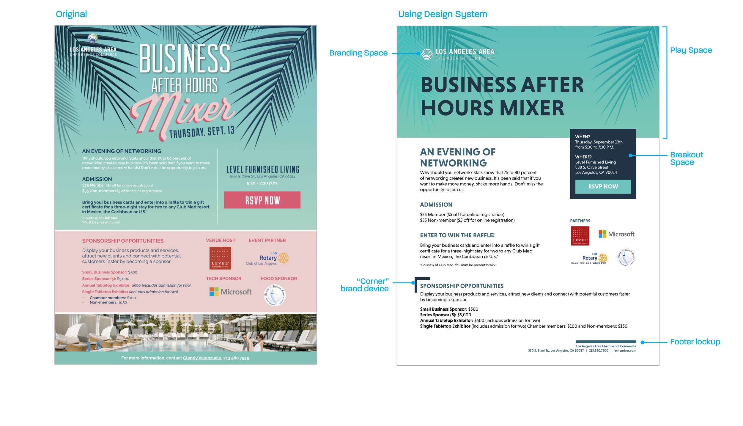
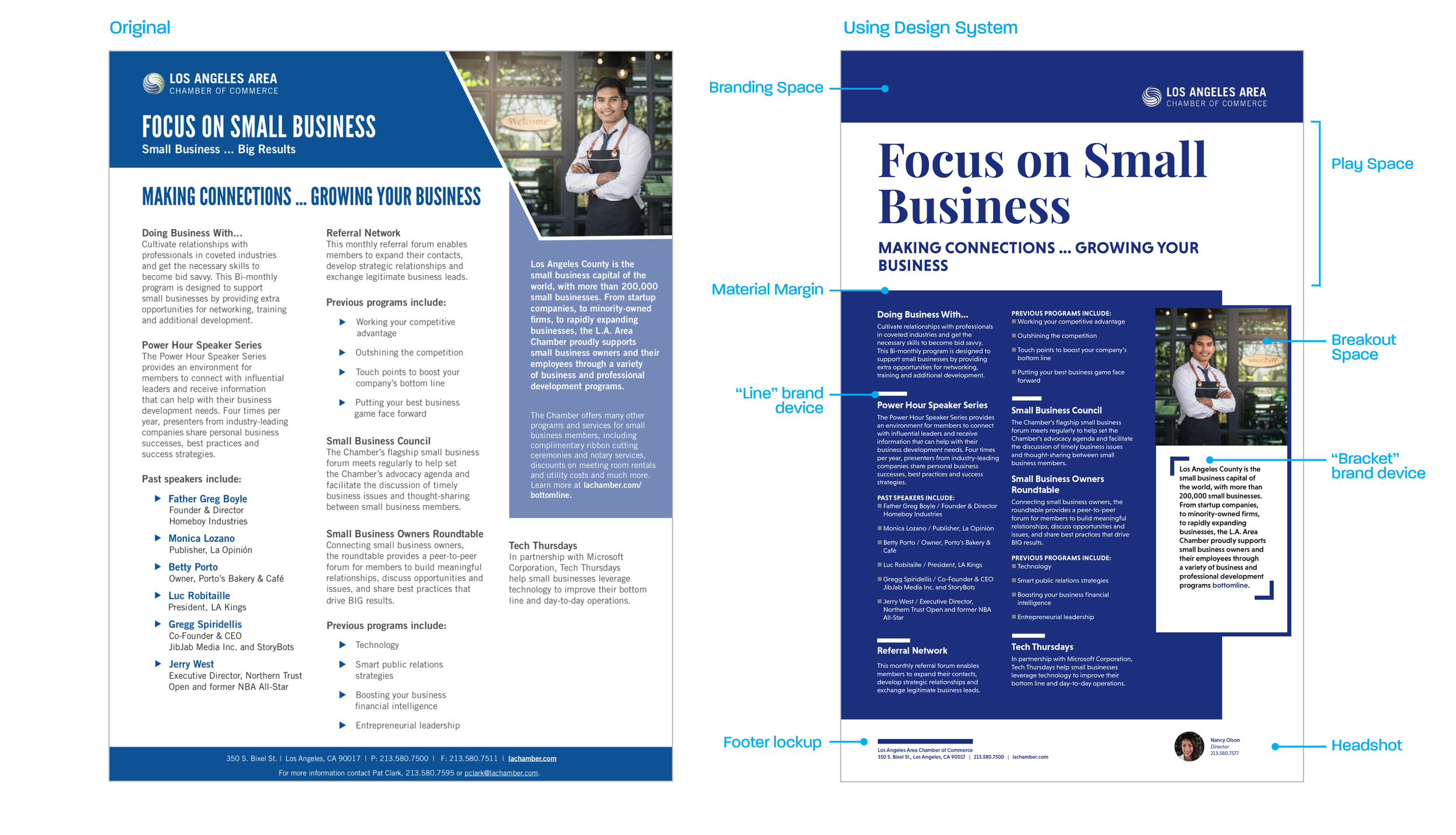
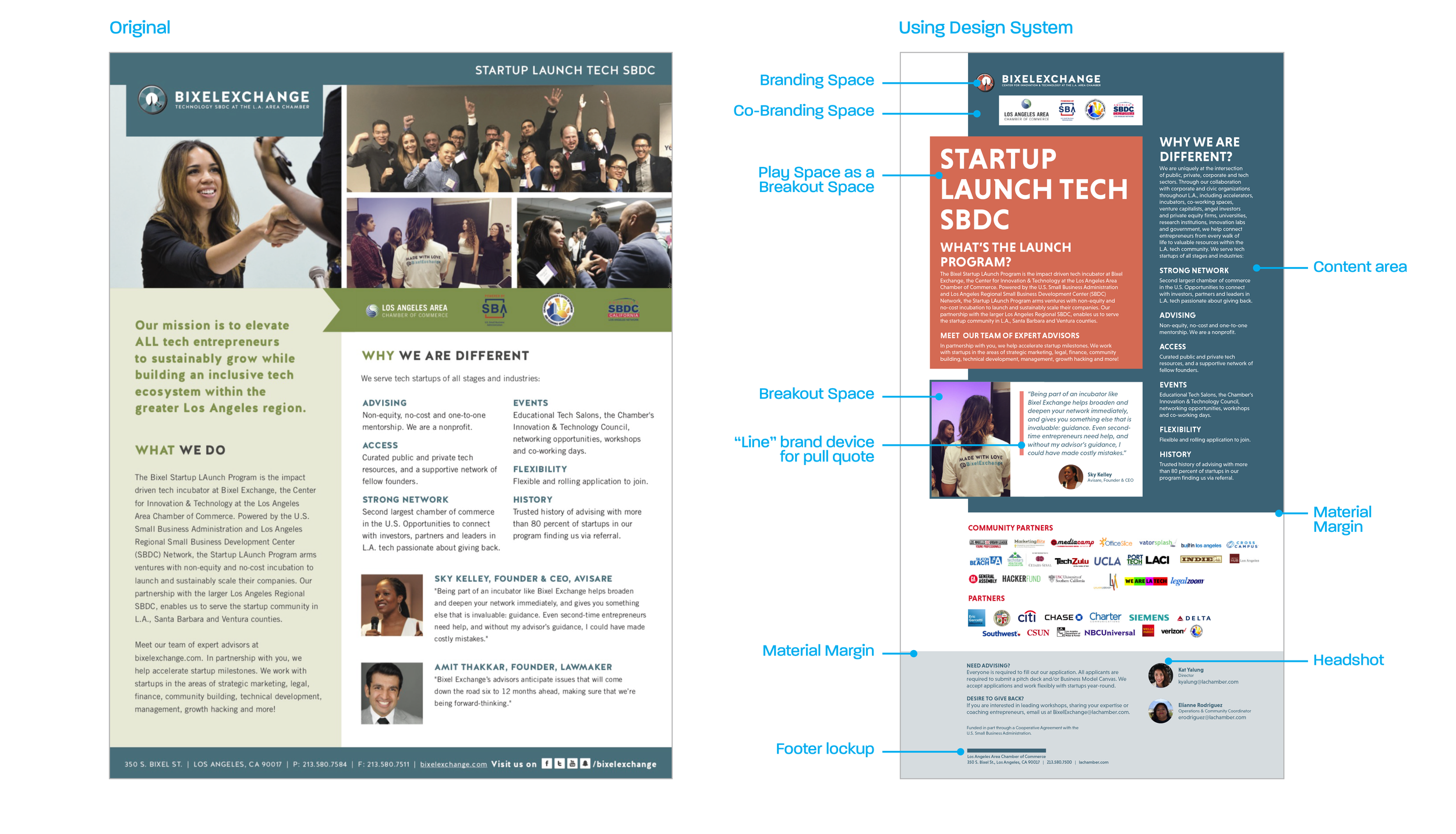
We determined that their layouts would need to contain five key components:
Branding Space – for consistent placement of LA Chamber logo and/or partner logos
Play Space – a contained space that can utilize any color, imagery, or font to suit the related purpose of the piece.
Content Space – the area that will contain the bulk of the communication content.
Breakout Space – a high impact visual area for communicating important details.
Material Margin – a visual divide between areas of the layout, allowing the ‘breakout space’ to overlap boundaries.
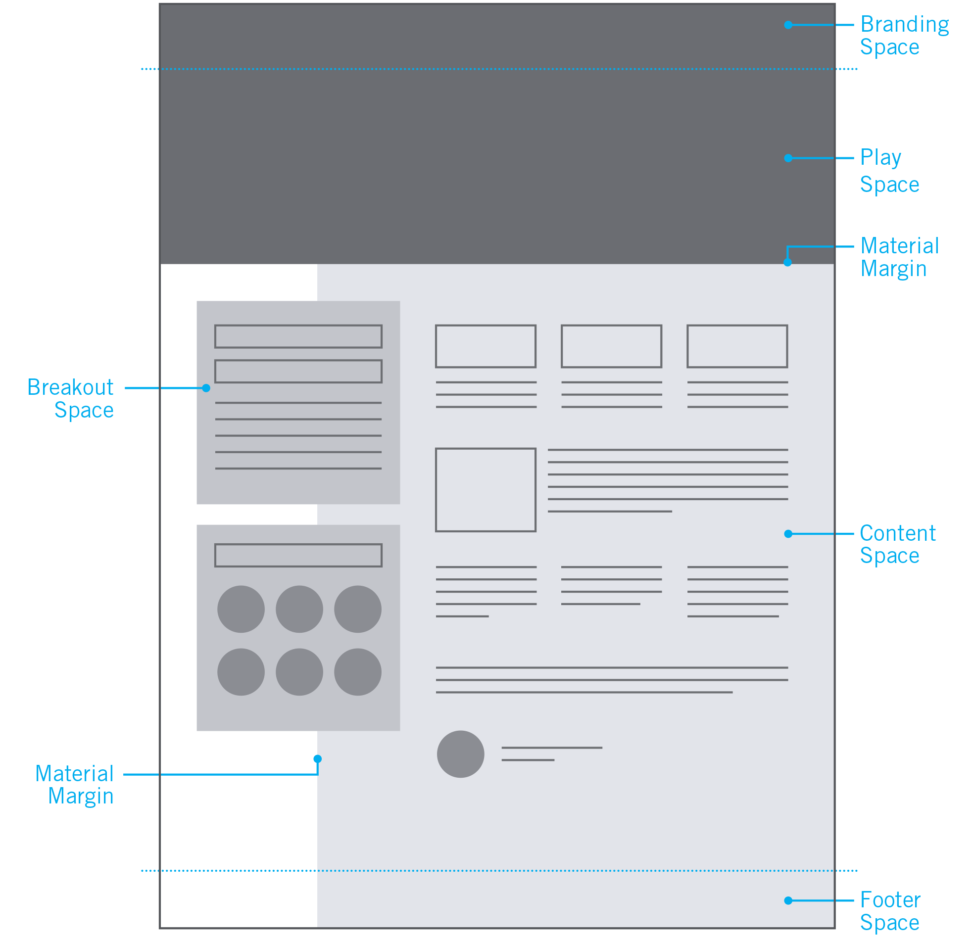
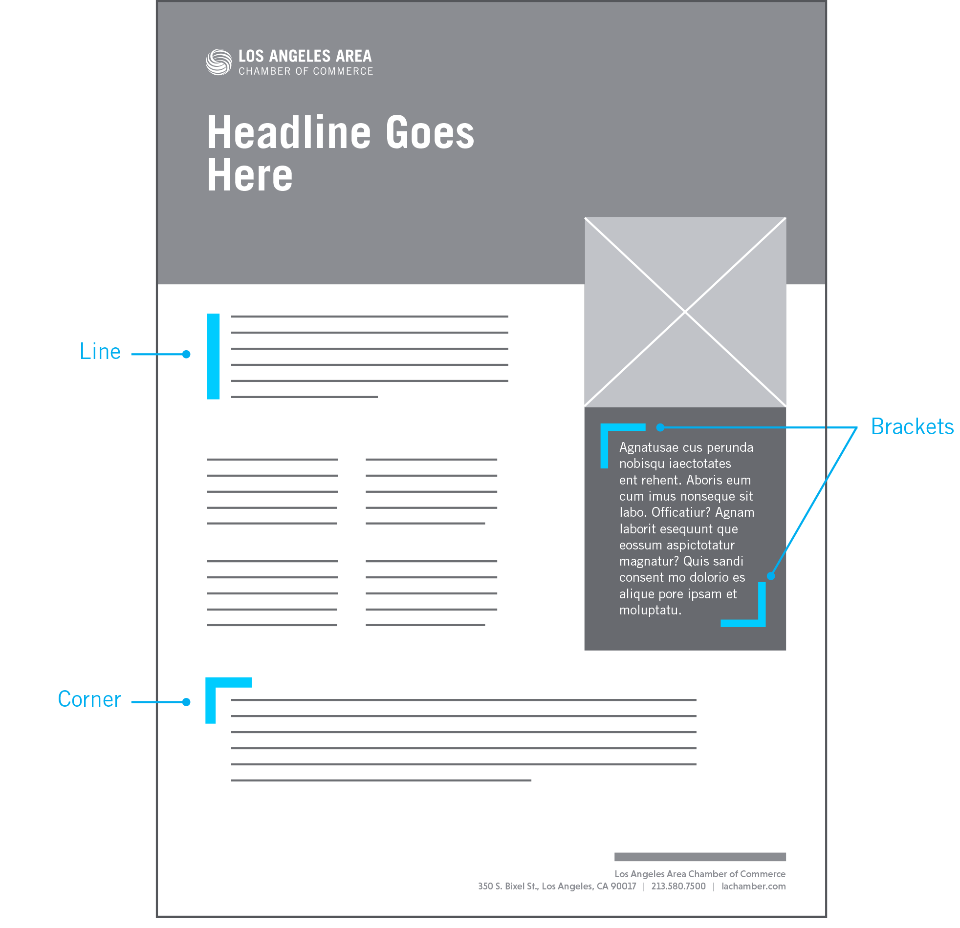
Additional brand devices (supporting visual elements) were encouraged such as thick divider lines, corner and bracket shapes to help ‘chunk’ content into easier to read segments. Creativity was encouraged by allowing any and all of these components to be used in any combination they wished.
3. Defined Color & font Mapping
Knowing some materials would need to be very formal while others would need to be fun and modern, we established an extensive color palette and collection of type styles that would allow designs to span from traditional to bold.
To help their team members determine which colors and fonts should be used, we organized them into perceptual maps. This allowed them to choose the ‘vibe’ their communication piece would need, and the appropriate colors and fonts would be indicated for them.


Sample color palettes were also provided for visual context to the perceptual maps.

Voila…a fresh new design system.
Combining all of these elements together, we were able to transition the LA Chamber team away from monotonous templates, to more engaging and consistent materials with an infinite array of visual possibilities.
Take a look at some before-and-afters: