Your UI is killing my UX
Unless you live under a rock (or maybe in a commune), you’ve probably heard that Apple just released iOS7. Annnd if you’ve already installed it, you’ve certainly noticed it looks more like a 3 year old’s toy than a modern OS. What you may not realize is that the hideous paint job of iOS7 is actually overshadowing what is a major improvement in user experience. So we thought this would be a good time to explain the difference between UX and UI design.
The difference (in a nutshell):
The user experience (or UX) design of a device describes how us human-folk interact and use the device. For example, pinching to zoom in on a picture is delightful and intuitive. That’s a good user experience.
The user interface (or UI) design is the what the screens and buttons actually look like – the fonts, colors and graphics that you see.
Now that you know the difference...
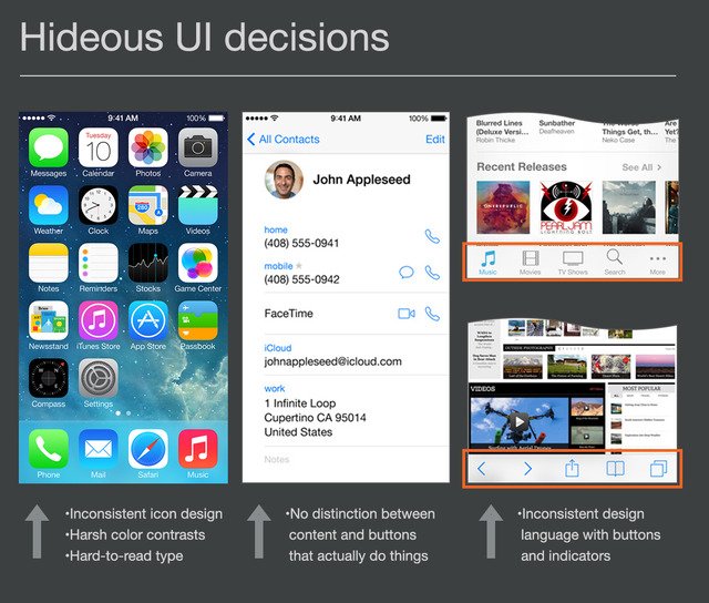
let’s practice with some screenshots from the new iOS 7:
So before you scream about how horrible iOS 7 is, try and look past the hideous UI and try and focus on the UX improvements that will make your iDevices easier to use. And let's all hope that Apple comes to their senses and cleans up the UI, shall we?


